I had the most fascinating discussion yesterday with someone on the topic of Usability and all the cool TLA's (Three-Letter-Acronyms) that go with it. You got your UI, UX, UA and then we get into UID which is broken further into UND, UID and UIID all of which are a part of HID and you can also get into about a dozen more thrilling alphabet soup combinations that mean nothing to most people.
Confused yet? Probably. Ironic isn't it that we make User experience one of the most complicated things. Maybe that's why most projects really don't put a lot into the actual User Interface Design beyond "Does it look cool enough that people are going to drool?". Just because something is cool - doesn't mean it's usable. If the pain of using it is more than a similar product - guess what? Most people will use the other product. So, that's why all the time's been spent on researching User Interfaces.
But are all UI easy to use - and just because they're easy does that make them good? Let's say you have two buttons for people to press - is that an easy to use interface? Not if the information on the buttons isn't clear.
One of my favorite examples of a bad user interface is from where I work. It's a sign that - so far I've found it in 5 parking garages this isn't a one time accident, it's always the same arrangement. Every time I see it - I chuckle. See if you can critique the problems with the design of this simple two button interface.

Here's my take on it...
- The Emergency button (Red) is smaller than the less important non-emergency button. (How do we know the non-emergency button isn't more important? Simple... it's an Emergency button.)
- The Emergency button (Red) box is below, making it less likely to be observed first - if you have an emergency, you want it to be the first thing you use, not the second.
- The Emergency button has no raised edges, nothing to prevent you from accidentally pressing the button, which is located next to a door and an area where people will frequently lean against the wall while chatting.
- The Non-Emergency box button isn't BLACK - it's Silver, and it's recessed in Metal.
- The Non-Emergency box button sign features a larger print font than the Emergency box sign below it. Larger fonts attract peoples attention more - giving them more importance.
- The Non-Emergency box is located in the same Red/White striped area as the Emergency box further confusing the Emergency and Non-Emergency boxes.
- The signs for both the Emergency buttons and the Non-Emergency buttons are both Red On White, further confusing people.
- There is no alternate messaging for the buttons for non-English speakers or the Handicapped (Braille).
In short - the UI on this is confusing and almost designed to cause users to not use them properly. I can add one more bit to this, the building where you will find these has people from all over the world, many of whom do not have full control of the English language well, further there is also at least one blind person who uses this building. So, localization and handicapped accessible considerations aren't just a good idea here they're known issues for the design.
So why didn't they consider that when this was created? Probably the same reasons most projects do not put much effort into Usability and User Experience design. It wasn't given a very high priority. It was probably not considered to be something cost effective enough to put a lot of thought into, and it probably was implemented by people who didn't have a background or training in UX.
Sound familiar? The same reasons for not putting forth the effort above - are more than likely the same excuses used not to put much effort into UA or UX on your projects. Now, ask yourself - if you can spot the problems above - how many of your users can see he same sorts of problems in your designs?
Usability - User Experience are not just good ideas. They're essential. They're even more essential when you are designing with global cultures in mind, and even further complicated if you are dealing with children or the handicapped. When we fail to design projects with them in mind we shut out whole consumer groups, entire global markets and often cause our users pain they do not need. Even if it's something as simple as a two button choice like the one above.
Let's look at how appearances can help or hurt you with UI, which with the new high graphics interfaces can now make what was an easy UI choice - a confusing one.
Icons good enough for XP!
Back in the early days of app development all you needed for an Icon was a 16x16 representation that often looked like something that an Atari home game system spewed out after a night of hard drinking. But today - we need to consider a few things they didn't have back in the Windows 98 days.
Once XP came along with it's fancy shmancy 256 color graphics those 16x16 icons weren't good enough for everyone. They had all these hot new sizes like 24x24 and 32x32 and - believe it or not - 48x48 and in ... hundreds and hundreds colors no less! Yeah, those easy going simple icons weren't good enough for Windows XP users. (For more info on how to make XP icons check out: http://msdn.microsoft.com/en-us/library/ms997636.aspx)
Now Vista comes along and if you plan on releasing it on the mac as well - oh man do not get me started!! It's Madness I tell you Madness!! - Just kidding. Bug if you want to find out more about Icons and the Guidelines for Vista... check out http://msdn.microsoft.com/en-us/library/aa511277.aspx.
For many designers this is, once again, confusing. Because just because your application is well represented on the desktop... doesn't mean it's well represented on all systems.

What you see above are examples of icons made for the complete scale of sizes. Not all the colors - just the sizes. In theory, you really don't need an Icon bigger than 48x48 for most uses - and even the most demanding situations, going above 128x128 isn't necessary. I include them here because yes there are some applications that do use the odd sizes but they're pretty rare.
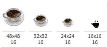
So to be totally honest the sizes I usually include are 16x16, 24x24, 32x32, 48x48 128x128 and I'll create them in RGB/A, 16m, 256, 16 and mono. If I know it's going to be used on a Vista system I'll toss in a 256x256 just for grins and giggles.
The completed set would include the following color schemes:

16 Million Colors are shown above... but no real "Alpha" channel like you see in the top RGB/A which is the current icon flavor of the day.
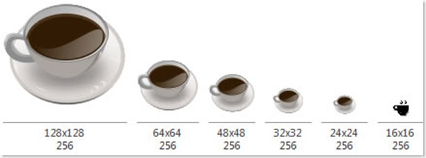
Back in the day... 256 Colors was good enough for anyone. Yup... of course back in those days Ronald Reagan was alive and Bruce Willis had a full head of hair.
Anyone remember Windows 3.1??
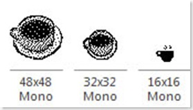
Believe it or not... Mono's making a comeback. If you're designing for the OLPC XO-1's uber Display with eBook mode you should seriously consider including some Mono (B&W) only Icons. The same goes for many medical and embedded applications. Creating Mono Icons takes some work. Making these look like an actual cup of coffee took the longest of all icon edits for this piece.


I'll continue this in the next blog where we show you some cool form tricks for getting icons to appear based on the desktop color schemes.
_________________________________________________________________________________________
 Posts
Posts


No comments:
Post a Comment