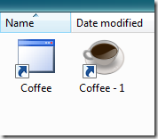
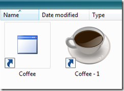
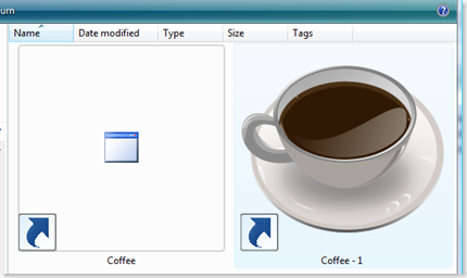
And ... I guess that brings me to our bonus round. On all of the icon scales shown above they all have a similar 16x16 sized icon. Why? Because of how people will see your icon the most. True, when they go looking for your application it's going to look like this...
Or even ... this...
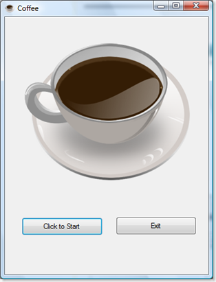
But the truth is - when it's in an application ... it'll look like this:
Which is fine... until you give this to your buddy and you look down in your friends Taskbar when it's running and it looks fine with your system and your background. But then you give a copy of the program to your buddy and it's really not workable.
Welcome to the cool new world of User Experience graphics. Now that people can, and will change their desktops. We need to always keep in mind that and at how we'll change and adapt to user preferences, choices and needs. Or... maybe... we won't
Many projects look at "bang for the buck" facts - and in some cases it just doesn't warrant the cost. Let's face it - something you're doing for just friends may not be worth it. But something that you do professionally for cash... might be. An In-House corporate project ... probably no one is going to care if the icon isn't great. But if it's going out to customers you want it to look professional.
The answer can be simple - the use of a color change for less expensive solution which requires a minor design change. That can yield a decent result of course.
Chameleon Icon Code
But... what if there isn't a good choice? What if you have an Icon that no matter what just will not look good on a dark background? Well simple - you get the application to change the icon to match the background color. How? Simple the background color scheme has specific values (Hue, Saturation, Brightness) and in the example below we do a nice little calculation and that on form load - checks the background color value and if it's greater than say... 0.86 uses one icon, if it's below that it load the other.
VB Sample Code:
Now, alternately - if you really want to get fancy - it's also possible to detect the values of the UI and change icons programmatically... here's some sample VB code that changes the Icon on the fly when the form loads:Private Sub Form1_Load(ByVal sender As System.Object, ByVal e As System.EventArgs) Handles MyBase.Load
Button1.Text = "Click to Start"
PictureBox1.Visible = False
PictureBox2.Visible = True
If Me.BackColor.GetBrightness() > 0.86 Then
'Quickie tip:
'This is directed at the resource we've included.
'Another (less useful way) to do this:
' Me.Icon = New Icon("C:\Users\UserName\Pictures\Coffee-Cup.ico")
'We don't want to do this because it would link it directly to a file location
'which isn't going to be on the end users computer.
'
Me.Icon = Drawing.Icon.FromHandle(Coffee.My.Resources.Coffee_Cup.Handle)
Else
Me.Icon = Drawing.Icon.FromHandle(Coffee.My.Resources.Coffee_Time.Handle)
End If
'Quickie tip:
' Add a Label to the form to get the contrast or color info you need.
' I'm using Getbrightness but there are other ways to do this
' as well. Play around with this for more cool tricks.
' Label1.Text = Me.BackColor.GetBrightness.ToString
End Sub
Using this when the background color (actually the color contrast) changes - causes your icon to change as well:
Now, we used obviously less than perfect examples above, so that we could demonstrate how it would look if it were in a colored motif at 16x16 x16 colors, and how it might look if we used a 16x16x 2 (mono) icon which looked well as an icon. Color helps - but what we really need to do is actually design a good 3D Icon.
Resizing them doesn't always work - we need to make sure that the resized image actually works. Compare both of the images below. When we resize them we need to make sure that they get some editing to extend the contrast. We've done this with the second image. ![]()
![]()
This is really the best solution - as you can see from the sample. But it does take the time to redesign the icon but if I'm sending this out to someone who is expecting a professional product this is the way to go.
Now if you play with the code snippet - you can see where there are a number of different possibilities for using this trick. Have some fun and play around with it and you'll find your applications to be far more accessible, interesting and professional to your users.
But lets add one more challenge... in the code above I'm calling icons that I've got on the local machine. In the code included - I've done some leg work for you and actually made it call them from the resources directory because a more practical solution is for them to be called from the resources files.
But ... consider... what the code might be like if there was only ONE icon, and instead of swapping the icon, we change the colors of the icon on the fly. So we don't need anything but one icon in our resources?
Think about that while you play with this code - and I'll work out some examples of changing the properties of the icon, the form, even the taskbar fonts - all based on the users preferences. The idea is they look professional no matter what the user does.
Source Code can be found on my Skydrive:
Which contains VB.Net code for the application demo'd here, and all the resources used for building it.
Other Resources & Links Used:
The Coffee Cup I used for the Icons comes from www.deviantart.com and specifically from http://nurutheone.deviantart.com who got the coffee cup from: mouserunner.deviantart.com/art/Desktop-Screenshot-61558516.
The second set of icons... Coffee_Time.ico comes from
http://www.iconarchive.com/show/city-icons-by-dimension-of-deskmod/Coffee-Time-icon.html.
_________________________________________________________________________________________


No comments:
Post a Comment