Monday, September 29, 2008

When people fly... and the world doesn't look the same anymore.


Got 3 video clips below...

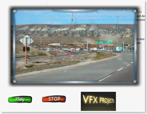
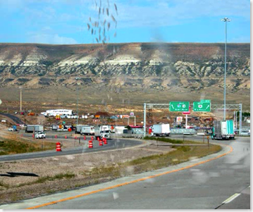
The first - is a video set extension.  Now - this was a very quickie done with a camera set on a fence post and the matte was done in about 15 minutes. 

Here's a quick before and after.

image image

Now on the left - you got the original.  On the right - we have new trees, mountains and so on.  Now - cool as this may be why on earth would you take the time to do this?  Because with a little smarts you might do your work once and have the ability to based on a users imageimagepreferences be able to change advertisements on the fly in video content for users on the web.  So that instead of me just walking - it might instead be me walking past a billboard. 

Or even walking someplace that you want to have the user go someday.  Now the technology to do this is already here.  As I pointed out this took me - what 10 minutes to do a simple matte painting.  A bit more work and the content that you can create can be very clean and crisp.  It's a question of putting in the amount of effort you want to put into this.  Content will become more and more important as more and more people turn to the Internet for free entertainment.  The better we make the content, the more people will be flocking to us.

Here's the video from that goes along with the clips above.


Now - what all can we do with content?  Well just for fun ... my son asked if I could show him how to do the "Superman runs and flies off" thing from Smallville.  Which is, surprisingly pretty simple to pull off.  First you'll need some simple footage of someone running... then have them jump as high as they can.  Once you have that, go to the frame with the highest portion of the jump.  You 'll need to take that frame and copy it to a editor.  You'll need to clip out just the person in mid jump and leave the background transparent.

Once you have that copy it back into your composition software.  Place it on the image, at a spot after the person running is now completely out of the shot.  Begin from the highest jump frame - stretch the image and begin to adjust it over the five or six frames that take the image out of the shot.  Add some motion blur - and if you want to be fancy add some particle effects and a sound effect.  (See video clip #2). 


Thursday, September 25, 2008

Tim Brenners Lee is an Idiot...

Okay - he's not. He's a very smart man. But those who parrot his words as if they were some written in stone fact are leaning toward being that one guy that the village is missing - if you know what I mean. If you do - just nod your head. Good.

I recently posited a question on LinkedIn regarding Web 3.0 - and it's in fact based on an earlier blog post here - and I specifically said I would not accept answers parroting Eric Schmidt or Tim Brenners Lee. Not because I disagree with the answers - but because I wanted peoples opinions... not regurgitating up to me what you read last week.

Here's the reality - and I'm pretty sure Tim Brenners Lee would agree with me on this, if you can't come up with your own definition of something - if you can't percolate up a NEW idea - if when asked to look to the future you robotically parrot out what you read this week as ideas for something... then your problem is something that needs to be addressed. Put down the text books and learn to use your creative thinking functions because they are swiftly dying.

Having defined why I called Tim Brenners Lee an Idiot - I'll now do something rude to all of you who keep insisting that Web 3.0 is the "Semantic Web" with machines talking to each other and blah, blah, blah... yes I've seen the video clips too people. It was a great speech. Just because a man whose famous says, "This is what I think" doesn't make it so. Later on - I'll do the name dropping game. If I had a nickel for every time a smart man said something that never came true - I'd have bought the Internet from Al Gore years ago.

But - for the sake of argument - let's assume Tim is right and Web 3.0 is the "Semantic Web" where machines talk to each other and information you generate is shared safely and fluidly back and forth. Uh... people... we have that. It's called Amazon.com. I'm only half joking here. Essentially any sufficiently advanced eCommerce system does just exactly what Tim Brenners Lee has called a "Semantic Web", and many of the Intranets for global corporations have similar mechanisms that take that even farther for ticketing and asset tracking and so on. Semantic Webs? Already here. Been here for years.

If that is the case then we need to start discussing Web 4.0. Because Web 3.0 came and went already. It's been here for about 7 years that I'm aware of. In fact Google and IBM and almost any major global corporation on the planet has that very scenario running one degree or another. If you're hoping for it to become something that Joe and Jane User do - as Sir Brenners Lee discusses - it's probably not going to happen because stop and ask yourself why they'd do it.

(Sighs)

In my time I've had the pleasure of listening to lectures from some of the most brilliant minds on the planet. From Hawking (in Salt Lake City before many of you even could power up a computer) and Eric Cornell in Physics (in Boulder with his Squirt Guns) and from Cliff Stoval to, yes, Tim Brenners Lee on subjects such as the internet. These are really really brilliant men. (Told you I could do the name dropping game ... here let me bring this home now...)

As Jakob Neilsen once said to me - well okay it wasn't to me specifically, but I was in the audience ... What is it that makes someone want to do that? Do they have a need to? Or do you you have a need to prove your viewpoint? Show me the need.

Joe and Jane User have no need to personally utilize a Semantic Web. And thats why the user front end for such a beast will not come into being. The back end of it - yeah - in fact as I pointed out most places already have it to one extent or another - that will be here if it isn't already. But no - the Semantic Web is not Web 3.0, and repeating that it will isn't going to change it.

Tim Brenners Lee is a great man. Almost all of his work I've enjoyed immensely but you can't put too much into predictions. Not by me. Not by him, not by anyone. The world evolves and it evolves very quickly when we involve technology. But it's always driven by peoples needs.

When Tim defined Web 3.0 he never explained how this met anyones needs. At least not to my satisfaction. He explained how it met their needs to his justifications and it's a beautiful vision of technology but it is near sighted, it doesn't take into account that corporate infrastructures have often had these very technologies in place for nearly a decade (ever wonder how Amazon or any great eCommerce site works? Yes - that is Brenners Lee's Semantic web in Action!). So that's not web 3.0. We have Tim Brenners Lee's vision of that right now in many ways.

What we don't have and what I have been asking for... is for people to give me their definition of that.

Tim Brenners Lee is a brilliant technologist. So is - Eric Schmidt - well ... okay he's not a Tim Brenners Lee, but I'd let him rebuild my laptop - and a lot of people keep quoting him also, and refering me to links of videos by both of them.

Which ... btw ... I find incredibly ironic that they find fault with my defining video entertainment and content as not being a core component of web 3.0... by sending me links of video content.

Now, I'm not saying that I know it all. Nor to be really honest am I saying that Video content is 3.0. It's not. But user generated content in new media will be. It will be when it's self sustaining - when it pays for itself in some fashion, and when it has it's own social group followings which help sustain it not only from a fiscal point - but also from a user generated base view point.

Many years ago, a very bright, but very... odd... artist named Andy Warhol said (and I'm paraphrasing) "..In the future everyone will have 15 minutes of fame.". I would go so far as to say that Web 3.0 will allow those who have the drive - to achieve that fame.

That having "living" content - either 3D or Video or some such level of interactive visual construct which is updated, has it's own stories, it's own life - be it a personal documentary, or something like "The Guild" (my obligatory Felicia Day plug) or Dr. Horrible (my obligatory Josh Whedon plug) or even works like Doktor Sleepless (my obligatory Warren Ellis plug) will be web 3.0.

That's my take. It doesn't make me smarter than Tim Brenners Lee. But it does make me smart enough to not make him... an idiot.

Wednesday, September 24, 2008

Expression Suite, Adobe Suite… it’s a suite world.

Sorry for posting these out of order here – but it’s been a bit hectic as I move things from the older blogs I can’t find the time to maintain. (Why I ever felt the need to break things among 4 blog sites or more I’ll never know.  I’m writing it off to Warren Ellis Envy and going with that.)

So… having said that let’s discuss what’s and whys of Microsoft’s Expression suite and Adobe’s CS3 Suite because that seems to be the topic of the day for many designers and developers. 

I’m not going to compare them as much as discuss their implications based on what they can do and why. 

Obviously – both are designed to create and design and develop applications that are for the web and desktop to some extent although Microsoft’s Expression leans more to the desktop as well as the web.  But both come from design roots.

Expressions, was originally a designer tool brought into the Microsoft fold – from it’s Expressions Designer.  It, when combined with Expressions Blend and Expressions Encoder allows for some very cool applications in very swift order that work with WPF (Windows Presentation Framework) and Silverlight the new toy on the web everyones been talking about. 

Now the reason why everyone keeps talking about it is because it’s supposed to be the “Flash Killer”.  Which – it’s not, in fact if you look closely at what it is – it’s a lot more than just something to be used for Flash type presentations.  It’s actually meant to allow a user to have most of the functionality of a full blown application – with a really slick GUI presentation system.

Flash on the other hand is designed to give you all the functionality of a really slick GUI presentation system, with a lot of things that can be done with applications.  Now, you can argue with me all you like on this point – but the fact is – Flash added the ability to code more as an offshoot of it’s graphics capabilities than if it had started out with that in mind.  Silverlight in many ways is more an ActiveX killer than a Flash killer because in a lot of ways apps generated in Silverlight do everything that ActiveX showed promise of, have all the power of Flash based abilities and do so with half the effort.

Now, there are things you can do in Flash that you can’t do in Silverlight and more than likely won’t be able to do for a good while.  Stuff like transparent overlays, etc., which – yes you could and can and I’m sure someone will do – but not as easily as Flash does them.  Silverlight however does have a heck of a leg up on Flash in one regard – it’s video capabilities are very impressive.  The quality, the stability are such that it’s not a competition.  Now, will Silverlight catch up to Flash in ease of use and understanding Designers?  I have no clue – but I suspect it will be a bit before we see a lot there.   (Mind you – this is my opinion – not my knowledge.  I have no clue what the Silverlight team or the Expression has up their sleeve any more than the next bloke walking down the street who reads the trade papers. )

But this is the core of it. It’s a question of priorities and how they evolved – not a question of what they can do now, and what they obviously want to do down the road.  Adobe is of the land of the designer, Microsoft is of the land of the developer.  Both – are very definitely racing to one destination with their products.

Adobe Suite – has a very solid and well established Graphical core to it’s purpose.  From Photoshop to Adobe After Effects – the goal is to take a project and provide all you need to produce an application that is visually stunning and does the job.

Expression Suite – of course is tied very closely (in fact you can open your Blend projects) with Visual Studio so code is it’s core.  It’s meant to take an application and give it all it needs to be stunning and do the job.

But what Job is that that these tools are pointing us to? 

My version of a web history lesson for designers and developers…

In the early days of both web and desktop development – Graphics meant images.  Still, strong images.  Like a color newspaper if you were making web pages.  But Macromedia changed all of that.  They created something called “Flash”.  This very cool vector based animation tool that allowed people to do all kinds of very cool and very crazy web sites and applications.  Flash became so over used and so overly popular that there were websites devoted to banning it from the internet because every web site seemed to need it for a while there, and the truth is – almost none did.

Eventually we learned as designers and developers that just because we “could” do something didn’t mean we “should” do it.  We got control over our Flash jones – and started using it for serious work.  LIttle Java scripted and Action Scripted things at first.  Then more complicated things.  But it to be honest lacked the punch of solid software code.  ASP and JSP and Java became the word of the day and for a while it looked as though we’d see Flash relegated to being icing on a cake. 

So Macromedia gave us better ActionScript and Adobe, who to be honest needed a good place to get into the web buisness as something other than “the guys that gave us Photoshop and Acrobat” bought out Macromedia.  Macromedia had worked well with most Adobe tools so this wasn’t a surprise to many of us – it was to be honest pretty much expected once they’d bought Coldfusion and Dreamweaver. 

What was surprising for many of us… was that Microsoft hadn’t bought them first.

Microsoft, needed to get into the graphics game had always had ASP, and ASP.NET and was gaining ground with web based application back ends.  They had the desktop software development market but lets face it – they didn’t have a tool to give all that code something to do.  After not acquiring Macromedia’s baby Flash – that put them in need of something that would allow them to get some bling into things.  Microsoft decided to roll their own tool – and while they were at it, they decided to roll it to the direction they were looking at for tools. 

Even though it’s still in it’s baby steps stage – Blend is a pretty impressive first effort.  When tied into the tools (Expression Design and Visual Studio) you have a very powerful app builder.  One that works as well for desktop apps as it does for web apps. 

The Future… or Why the Heck All These Goofy Video Tools?

Now – what’s most interesting about the Suites from Adobe and Microsoft is very clearly one thing… video plays a big role.  We don’t know why.  We don’t know how – but it does.  It does because right in the middle of both suites – what takes up a lot of product real estate – are tools used to edit and encode video and incorporate them into applications. 

Guess what?  When the two biggest hammerheads of the web shark world drop that much effort into something – they’ve already looked at the landscape and decided there is a big market for it.  It’s too expensive to take up all that product real estate in a suite, unless you expect the users will be using it. Using it… a Lot.  Like… big time.

So – now comes the question for all good developers and designers.  What skills do these tools bring to your game?  The ability to encode and incorporate video into your tools.  To edit that video.  To work around a moving space – and even a moving 3D space. 

We as developers and designers need to understand this.  We need to embrace it and start working on not just the current interfaces for users.  Two Dimensional Flat interfaces – but interfaces which move.  Move fluidly, and can be interchanged on the fly, and will activate other things. 

Buttons that when you pass over them don’t just give you a display icon or a tool tip – but thumbnails of what the button actually is expected to do – even microtutorials in some cases.  We need to re-evaluate what a button is – what is interaction?  Do we need to explain something when we can just show them it as quickly as they can read it?  Will web sites and applications in the future offer Video first – with an option to down load a text tutorial and FAQ as the right click – instead of the other way around like we have it today?

Suite tools – allow us to bring a project from cradle to grave.  With one person having in their hands the ability to trade a lot of hats in the work flow.  A lot of different job needs and different job skills.  Originally, a developer – simply needed to code.  They had very little need to understand graphics and UI.  Designers code?  Madness!  But we’ve evolved and most of us can – to varying extents do both. 

Flash – changed that.  Developers had to now consider moving graphics interfaces, the forms we built no longer had to be square, and slide like tiles across a window.  They could be any color, and any shape.

Now we are faced with new challenges and new skills to be added to our tool box.  We now have to understand video – not merely motion graphics but video itself.  We now have to have an understanding of how to tell a story, depth to our visuals, our vision and our content itself. 

And… all of that still needs to actually fit a purpose, a need, a functional coded application requirement.  Or all the coolness will give us what we had in the early abusively torrential Flash Website days of the internet.  We need to be responsible and understand how such tools can work without over powering. 

We’ll need to understand storyboarding that incorporates actions based on user input.  We’ll need to be able to provide our video – with a technical understanding of what’s going on with the machine.

Ms. Dewey – and Left vs. Right are cool interfaces.  But they’re a prototype and not the model to set the standard by.  We – are who will set the standards and drive the direction.  But to do that we need the skills.  Adobe and Expression Suites give us the tools – we just… need to develop them.
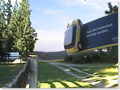
Web 3.0 has been paid for by these fine Sponsors…

or as I like to think of it…

The Future of your Job in IT

image Since I moved over to the new blog site, I’ve done a couple of write ups of some basic code that involves Usability, Microsoft Expression Blend and Designer, and similar tools and I’ve made mention of Silverlight, and WPF and of all things… Adobe After Effects and even Wondertouch software’s tools lately.   I’ve hinted that these are skills everyone needs in the time to come. 

But a lot of these are design elements, a lot of these are video production tools and CGI tools.  And Usability  … how does that tie in to them?  And more importantly how does all of that translate into real world work – if you’re not working for a global-mega-conglomerate with a multi-bahzillion dollar budget how often will you need those tools those skills?

I mean, c’mon I can’t really expect Joe Developer or Jane Designer out there to break out what amounts to a couple grand in software just for a simple database application right?

So here’s where I bring together some of these strange elements of design and development into something that makes sense and direction to this scattered madness. 

About two months ago I began noticing a trend in Program Management and Developer recruiters in the IT industry that called me about jobs.  Now, generally they ask for experience in Java or Flash for design work, and they ask about C# or C or C++ if it’s an application … sometimes they toss in WinAPI or Win32 if they are trying to sound like they know things.  If it’s a Web job – it’s ASP.NET or C# and Visual Studio.

But what triggered was suddenly the number of calls for skills with WPF, for Silverlight and this caught my attention.  Not one or two – but around 15 different recruiters asking for skills in these areas in 2 months.  So this kind of a trend isn’t coming … it’s hit.  Odds are it’s only going to get bigger.

Why?  Why not just go with Flash which is the traditional standby, or GDI?  Good question.  So I started paying attention to what they wanted in the job requirements I was seeing.  The trend is very clear – video is finally coming of age and it doesn’t matter if you’re Microsoft or IBM or Saul’s All Night Diner out on Route 4… people know that it’s on the web.

Recently a study showed that an alarming number of people are doing most of their entertainment viewing over the Internet.  Movies and TV shows which last year were just “Tivo’d” are now – on demand for people.  And that’s not where the entertainment trail ends.  The Internet, and computers in general are finally pushing the envelope between work and play areas for games into entertainment centers.  (Bill Gates should be proud – he’s only been saying this was coming for about 15 years.)

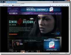
image If we learned anything from Radio, TV, and the Internet – it’s that once there’s a market, people figure out how to advertise on it effectively.  Recently Sci-Fi channel has had a very strange and for the most part really cheesey little known all internet series going called, “Gemini Division” starring Rosaria Dawson and Justin Hartley (who seems to be in everything on TV lately from Smallville to Supernatural to you name it – I frankly expect him to turn up on Two-and-a-Half men next week just because he’s missed that show).

Cool huh?  Content that only people on the Internet – only people with a computer… get.  It’s directed at a specific kind of user and that user is “US” – the geeks have finally inherited the earth!

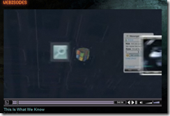
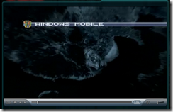
But… Now it’s time to stop and ask… who’s paying the tax on all that real estate?  I mean lets face it – imageuninterrupted shows with big name actors and all aimed at us – that ain’t cheap.  Someone has to pay these people so … who is it?  Here’s a clue… you’ll see something like this in every episode.   image What’s that uber cool interface on her uber cool video/internet phone of the future?  Well it’s some kind of new never seen before Microsoft Mobile device interface isn’t it?  Wait… how’s she locating stuff?  Why… it’s Microsoft Live Search and Microsoft Live Maps. 

In the time span of almost 15 seconds – Microsoft got more positive exposure with a directed audience they KNOW is interested in their product than if they’d paid for the entire show… and no – they didn’t.  Because they’re not the only advertiser in the show… there are dozens.  The commercials don’t interrupt the show – because they’re all through it.  The commercials ARE the show.

And this isn’t the only show to do this.  Let’s discuss one of my favorite shows which has been frankly over the

Made in Eureka Degree for Men
top with the whole “we’re actually a commercial” concept.  In fact they came right out the first episode this season and told us that they were going to do this – right to our faces.

At the end of the first episode – they had the cast ask “Hey whats all this stuff?” as the guys from the Degree for Men came pushing in crate after crate of the product on set.  The response was and yes I am paraphrasing, “You’ll be seeing a lot of changes around here, we’re going to be profitable and this is one of the first of many corporate sponsors for (Eureka).”.  Which is exactly what was going on in real life – making it even more fun to see it on the show. 

They not only did real Degree for Men commercials with the cast in character for spots during the shows  – they’ve taken it a step farther and it’s a running gag in the show that they’ve even used to save the day with Degree for Men – able to withstand the blistering heat of the sun!

And – btw – the shows are all downloadable off the Internet.  Something we’re seeing over and over all across the internet.  In time – we’re likely to see content and bidding wars from sponsors for shows on the internet.  Got a video blog that’s popular?  Here’s $5,000 if you suck down a cola with the right brand – and only that cola.  That’s where its not just heading – its already there in some parts of the net.

So where does that fit into us as developers and designers for the web and the desktop?  Where do we fit into all of this? 

If you think for one second that this is a fad and it’s going to die out – you’re sadly mistaken.  This is now officially a multibillion dollar a year market that has just been tapped.  It’s the reinvention of the Internet for the 3rd time.  This is … the Web 3.0. 

I’ll make the prediction that it’ll start slowly for most – initially it’s going to be people asking, “Hey I’ve got a car company – what would it take to make a TV show just around my car company… just stupid like 20 –30 second skits to put on our web page that we update every month or so??”. 

That’s where it starts.  And then when someone does it – someone else will say, “You know who you should talk to is Bob Jakobson <insert your name for mine here> … I saw some of his work and it’s freakin great!  You bring him your video and he cleans it up and adds computer effects and drops it on your web site and the fee is pretty damn cheap.”.

The next thing you know guess what?  We’re all back in the days when anyone who knew Flash and Actionscript could be guaranteed a job.

And… it’s not going to stop there.  It’ll be desktop apps and sidebar widgets and you name it. 

Now do you see why I’ve been going in this direction?  Because it’s the only direction we have in a very uncertain economy that puts us ahead of the pack – that puts us forward.  And at the end of the day that’s really what it’s about for every designer or developer out there, being able to pay the bills with our day jobs while we dream of what the future is and push one step farther into it. 

So… next time – I will update you with more coolness on this front with more toys and code and fun now that we’ve established the direction.  :-) 

Monday, September 22, 2008

Refilling Your Cup...

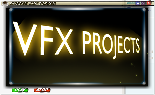
Hey... here's the quickie demo promised using Silverlight and some After Effects.  Consider this as Drop One of several - the key purpose is to see what can be done with different types of video and ways of displaying them in WPF and Silverlight. 

The code here is meant for beginners - since it's a Father/Son project.  So don't expect anything fancier than transparent forms.  But the idea is - if you've never done any coding, here are some different ways to get hi-tech results with very little coding. 

image

Here's the trick to the Minimize, FullScreen and Close buttons on the form - that you DO have to code yourself.  The code for this is pretty simple - but the first trick is to make the form itself transparent.  How? 

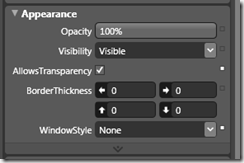
First click on the Window - then go over to Properties in Blender.  Scroll down until you find the Appearance settings.  Check the box for "AllowTransparency" - you'll notice the form suddenly has changed, and the Window Style dropdown box has now gone to "None".

image

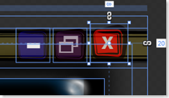
Next ... you're going to need to be able to close your application somehow, so add a Minimize, FullScreen and imageimageClose image.  You can create these anywhere, I used Expression Design - and then exported them as XAML files.  But a standard Image file will work just fine.  Once you've loaded them on to the form, select each image and then click  On Tools... and then "Make Button".

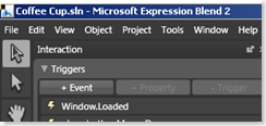
Once you've made them into buttons... you can add code to them.  How easy is this to do?  Simple.  Open the XAML code in the editor of your choice... if you have a copy of Visual Studio (Express or 2008) you can then double click on the button you created in Blend in the GUI.  This will open the code for you and populate the button_click information. 

Here's some quickie code to do this...

Private Sub Button1_Click(ByVal sender As System.Object, ByVal e As System.Windows.RoutedEventArgs) Handles Button1.Click
'Closes the Application
Close()
End Sub

Private Sub
Button2_Click(ByVal sender As System.Object, ByVal e As System.Windows.RoutedEventArgs) Handles Button2.Click
' Maximize the form window
Me.WindowState = WindowState.Maximized
End Sub

Private Sub
Button3_Click(ByVal sender As System.Object, ByVal e As System.Windows.RoutedEventArgs) Handles Button3.Click
' Minimize the form window
Me.WindowState = WindowState.Normal
End Sub


Next we'll cover more advanced buttons... and more advanced video tricks. 


Things like smoke on the water... and (I have to say this) ... and Fire in the Sky. 


As always you can download the code from:


(I'll encode the video file to a smaller size in the next go round when we cover some encoding techniques that make it more practical for distribution.  This is raw .AVI footage.)

The Incredible SilverLightness of Being...

Man - this week has been a serious brain burner so I have very little to put down except to say a LOT of cool stuff is coming.  I broke down and started doing a bit of coding with Expression Blend and some of the tools to get a better handle on fun to create interfaces with WPF.

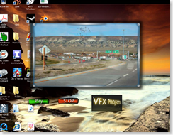
Here's a taste of the WPF Goodness ...image

Which is to say that's a screen shot of the app, which when run is transparent except for the player.  Heres a nice shot with a light imagebackground...

I haven't played with Blend since CTP days when it was fresh from Beta and I have to say I'm very impressed.  When combined with Expression Designer it's actually pretty fun.  The buttons for the app were designed in Designer and exported as XAML that I pulled straight into Blend.  A few clicks later and they gave me all the functionality I needed in about 10 minutes the player you see was done.  One of the easiest tasty bits of fun coding I've done in a while.  image

In part this was due to some fun with Adobe After Effects and playing around with some fun video clips to get the effects I wanted.  I have to say I haven't played with really decent video composition software in a long time.  It's come such a long way.image  After a bit of time watching a few Andrew Kramer video tutorials on line I decided to see about working on some fun but realistic video effects.  Which, if you haven't checked out Kramer's Video Copilot web site - it's all but essential if you want to do anything of value with After Effects - to say I recommend it is an understatement.

So why all the sudden love for video?  And what's it got to do with Silverlight and or WPF?

Simple.  I'm going to make a prediction for every great web / application designer / developer out there.  If you do not learn to use video compositing, 3D Modeling, and similar tools you should probably pick out your rocking chair at the home for old and unwanted web gurus. 

Just as in our day, FLASH and Javascript and DHTML and so on - were the "gotta have skills" of the 1990s-2007...  video composting and the use of video and / or 3d models in our designs, our coding architectures and in almost every way we handle the next generation of applications and web designs will be the core.

Having cool "mouse over images" and Javascripted / ActionScripted apps isn't going to be enough.  And I'll be honest Flash isn't going to be able to handle the demands of the next generation.  I think Silverlight may hold promise and it's certainly going it's focus on the right end of things but it's not there yet for us. 

In playing with Adobe After Effects - I found the ability to composite images and video to be a fascinating exercise.  Levels of visual sophistication we'd generally put on multimillion dollar ad agencies were at my fingertips.  I'll put up some different designs here soon and some code for all to play with so you can see some of the fascinating things that await us as I see them. 

I really wanted to get this up for this week - but got side tracked by that real life thing and having to do a phone interview or two and some tests I'm doing this week  Not to mention ... my family insisted I leave the computer alone and actually speak to them.  (Incredibly narrow minded of them ... I spoke with them last month!) 

Anyway, soon as I can get the code and demos up properly - I will.  In the mean time here's a video I composited from an old photo of rock springs and some well placed particles in after effects. 


Thursday, September 18, 2008

OLPC Goes to Peru

As reported windows XP for the OLPC XO-1 is headed for Peru!  Yay Team!  I know the guys with my old team imageover in the Microsoft UPG are really excited about this - as well they deserve to be.  It's been a long road and it's really exciting to see it happening. 

Congrats to everyone over at Microsoft Unlimited Potential and the associated teams at Microsoft that are needed to make this happen - and of course congrats to OLPC for making a great unit for the software to run on!

Monday, September 8, 2008

Chameleon Code for UI

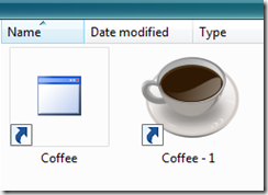
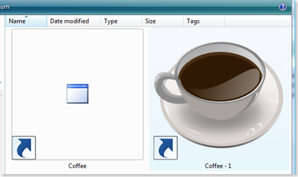
And ... I guess that brings me to our bonus round.  On all of the icon scales shown above they all have a similar 16x16 sized icon.  Why?  Because of how people will see your icon the most.  True, when they go looking for your application it's going to look like this...

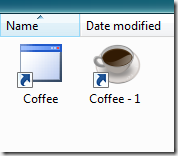
image
Or this...
image

Or even ... this...

image

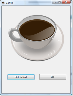
But the truth is - when it's in an application ... it'll look like this:

   image   

Which is fine... until you give this to your buddy and you look down in your friends Taskbar when it's running and it looks fine with your system and your background.  But then you give a copy of the program to your buddy and it's really not workable.

Welcome to the cool new world of User Experience graphics.  Now that people can, and will change their desktops.  We need to always keep in mind that and at how we'll change and adapt to user preferences, choices and needs.  Or... maybe... we won't

Many projects look at "bang for the buck" facts - and in some cases it just doesn't warrant the cost.  Let's face it - something you're doing for just friends may not be worth it.  But something that you do professionally for cash... might be.  An In-House corporate project ... probably no one is going to care if the icon isn't great.  But if it's going out to customers you want it to look professional. 

The answer can be simple - the use of a color change for less expensive solution which requires a minor design change.  That can yield a decent result of course. 

Chameleon Icon Code

But... what if there isn't a good choice?  What if you have an Icon that no matter what just will not look good on a dark background?  Well simple - you get the application to change the icon to match the background color.  How?  Simple the background color scheme has specific values (Hue, Saturation, Brightness) and in the example below we do a nice little calculation and that on form load - checks the background color value and if it's greater than say... 0.86 uses one icon, if it's below that it load the other.

VB Sample Code:
Now, alternately - if you really want to get fancy - it's also possible to detect the values of the UI and change icons programmatically... here's some sample VB code that changes the Icon on the fly when the form loads:

Private Sub Form1_Load(ByVal sender As System.Object, ByVal e As System.EventArgs) Handles MyBase.Load
Button1.Text = "Click to Start"
PictureBox1.Visible = False
PictureBox2.Visible = True

If Me
.BackColor.GetBrightness() > 0.86 Then
'Quickie tip:
'This is directed at the resource we've included.
'Another (less useful way) to do this:
' Me.Icon = New Icon("C:\Users\UserName\Pictures\Coffee-Cup.ico")
'We don't want to do this because it would link it directly to a file location
'which isn't going to be on the end users computer.
'
Me.Icon = Drawing.Icon.FromHandle(Coffee.My.Resources.Coffee_Cup.Handle)
Else
Me
.Icon = Drawing.Icon.FromHandle(Coffee.My.Resources.Coffee_Time.Handle)
End If
'Quickie tip:
' Add a Label to the form to get the contrast or color info you need.
' I'm using Getbrightness but there are other ways to do this
' as well. Play around with this for more cool tricks.
' Label1.Text = Me.BackColor.GetBrightness.ToString
End Sub


Using this when the background color (actually the color contrast)  changes - causes your icon to change as well:


image image


Now, we used obviously less than perfect examples above, so that we could demonstrate how it would look if it were in a colored motif at 16x16 x16 colors, and how it might look if we used a 16x16x 2 (mono) icon which looked well as an icon.  Color helps - but what we really need to do is actually design a good 3D Icon.


Resizing them doesn't always work - we need to make sure that the resized image actually works.  Compare both of the images below.  When we resize them we need to make sure that they get some editing to extend the contrast.  We've done this with the second image. 
image  
image 


This is really the best solution - as you can see from the sample.  But it does take the time to redesign the icon  but if I'm sending this out to someone who is expecting a professional product this is the way to go.


Now if you play with the code snippet - you can see where there are a number of different possibilities for using this trick.  Have some fun and play around with it and you'll find your applications to be far more accessible, interesting and professional to your users.  


But lets add one more challenge... in the code above I'm calling icons that I've got on the local machine.  In the code included - I've done some leg work for you and actually made it call them from the resources directory because a more practical solution is for them to be called from the resources files. 


But ... consider... what the code might be like if there was only ONE icon, and instead of swapping the icon, we change the colors of the icon on the fly.  So we don't need anything but one icon in our resources? 


Think about that while you play with this code - and I'll work out some examples of changing the properties of the icon, the form, even the taskbar fonts - all based on the users preferences.  The idea is they look professional no matter what the user does.


  Source Code can be found on my Skydrive:

Which contains VB.Net code for the application demo'd here, and all the resources used for building it.


Other Resources & Links Used:


The Coffee Cup I used for the Icons comes from www.deviantart.com and specifically from http://nurutheone.deviantart.com who got the coffee cup from: mouserunner.deviantart.com/art/Desktop-Screenshot-61558516.


The second set of icons... Coffee_Time.ico comes from

http://www.iconarchive.com/show/city-icons-by-dimension-of-deskmod/Coffee-Time-icon.html.  
_________________________________________________________________________________________

Saturday, September 6, 2008

What part of "Usable" do we not understand?

I had the most fascinating discussion yesterday with someone on the topic of Usability and all the cool TLA's (Three-Letter-Acronyms) that go with it.  You got your UI, UX, UA and then we get into UID which is broken further into UND, UID and UIID all of which are a part of HID and you can also get into about a dozen more thrilling alphabet soup combinations that mean nothing to most people.

Confused yet?  Probably.  Ironic isn't it that we make User experience one of the most complicated things.  Maybe that's why most projects really don't put a lot into the actual User Interface Design beyond "Does it look cool enough that people are going to drool?".    Just because something is cool - doesn't mean it's usable.  If the pain of using it is more than a similar product - guess what?  Most people will use the other product.  So, that's why all the time's been spent on researching User Interfaces. 

But are all UI easy to use - and just because they're easy does that make them good?  Let's say you have two buttons for people to press - is that an easy to use interface?  Not if the information on the buttons isn't clear. 

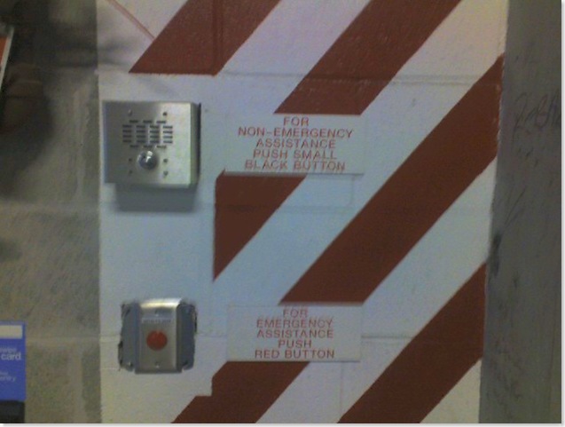
One of my favorite examples of a bad user interface is from where I work.  It's a sign that - so far I've found it in 5 parking garages this isn't a one time accident, it's always the same arrangement.   Every time I see it - I chuckle.   See if you can critique the problems with the design of this simple two button interface. 

phone 018

Here's my take on it...

  1. The Emergency button (Red) is smaller than the less important non-emergency button. (How do we know the non-emergency button isn't more important?  Simple... it's an Emergency button.)
  2. The Emergency button (Red) box is below, making it less likely to be observed first - if you have an emergency, you want it to be the first thing you use, not the second.
  3. The Emergency button has no raised edges, nothing to prevent you from accidentally pressing the button, which is located next to a door and an area where people will frequently lean against the wall while chatting.
  4. The Non-Emergency box button isn't BLACK - it's Silver, and it's recessed in Metal.
  5. The Non-Emergency box button sign features a larger print font than the Emergency box sign below it.  Larger fonts attract peoples attention more - giving them more importance.
  6. The Non-Emergency box is located in the same Red/White striped area as the Emergency box further confusing the Emergency and Non-Emergency boxes.
  7. The signs for both the Emergency buttons and the Non-Emergency buttons are both Red On White, further confusing people.
  8. There is no alternate messaging for the buttons for non-English speakers or the Handicapped (Braille).

In short - the UI on this is confusing and almost designed to cause users to not use them properly.  I can add one more bit to this, the building where you will find these has people from all over the world, many of whom do not have full control of the English language well, further there is also at least one blind person who uses this building.  So, localization and handicapped accessible considerations aren't just a good idea here they're known issues for the design. 

So why didn't they consider that when this was created?  Probably the same reasons most projects do not put much effort into Usability and User Experience design.  It wasn't given a very high priority.  It was probably not considered to be something cost effective enough to put a lot of thought into, and it probably was implemented by people who didn't have a background or training in UX. 

Sound familiar?  The same reasons for not putting forth the effort above - are more than likely the same excuses used not to put much effort into UA or UX on your projects.  Now, ask yourself - if you can spot the problems above - how many of your users can see he same sorts of problems in your designs?

Usability - User Experience are not just good ideas.  They're essential. They're even more essential when you are designing with global cultures in mind, and even further complicated if you are dealing with children or the handicapped.  When we fail to design projects with them in mind we shut out whole consumer groups, entire global markets and often cause our users pain they do not need.  Even if it's something as simple as a two button choice like the one above.

Let's look at how appearances can help or hurt you with UI, which with the new high graphics interfaces can now make what was an easy UI choice - a confusing one. 

Icons good enough for XP!

Back in the early days of app development all you needed for an Icon was a 16x16 representation that often looked like something that an Atari home game system spewed out after a night of hard drinking.  But today - we need to consider a few things they didn't have back in the Windows 98 days.

Once XP came along with it's fancy shmancy 256 color graphics those 16x16 icons weren't good enough for everyone.  They had all these hot new sizes like 24x24 and 32x32 and - believe it or not - 48x48 and in ... hundreds and hundreds colors no less!  Yeah, those easy going simple icons weren't good enough for Windows XP users.  (For more info on how to make XP icons check out: http://msdn.microsoft.com/en-us/library/ms997636.aspx)

Now Vista comes along and if you plan on releasing it on the mac as well - oh man do not get me started!!  It's Madness I tell you Madness!!  - Just kidding.  Bug if you want to find out more about Icons and the Guidelines for Vista... check out http://msdn.microsoft.com/en-us/library/aa511277.aspx

For many designers this is, once again, confusing.  Because just because your application is well represented on the desktop... doesn't mean it's well represented on all systems.

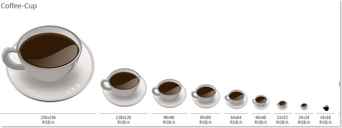
Coffee-Cup JPG Snapshot

What you see above are examples of icons made for the complete scale of sizes.  Not all the colors - just the sizes.  In theory, you really don't need an Icon bigger than 48x48 for most uses - and even the most demanding situations, going above 128x128 isn't necessary.  I include them here because yes there are some applications that do use the odd sizes but they're pretty rare.

So to be totally honest the sizes I usually include are 16x16, 24x24, 32x32, 48x48 128x128 and I'll create them in RGB/A, 16m, 256, 16 and mono. If I know it's going to be used on a Vista system I'll toss in a 256x256 just for grins and giggles.

The completed set would include the following color schemes:

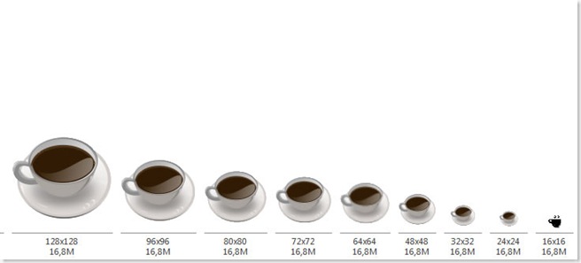
Coffee-Cup XP Snapshot

16 Million Colors are shown above... but no real "Alpha" channel like you see in the top RGB/A which is the current icon flavor of the day.


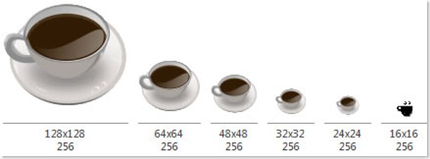
Coffee-Cup 256 Snapshot
 
Back in the day... 256 Colors was good enough for anyone.  Yup... of course back in those days Ronald Reagan was alive and Bruce Willis had a full head of hair.

Coffee-Cup 16 Snapshot 

Anyone remember Windows 3.1??

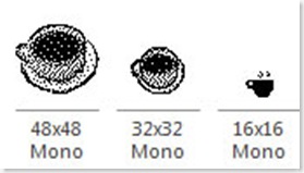
Coffee-Cup Mono Snapshot

Believe it or not... Mono's making a comeback.  If you're designing for the OLPC XO-1's uber Display with eBook mode you should seriously consider including some Mono (B&W) only Icons.  The same goes for many medical and embedded applications.   Creating Mono Icons takes some work.  Making these look like an actual cup of coffee took the longest of all icon edits for this piece. 

I'll continue this in the next blog where we show you some cool form tricks for getting icons to appear based on the desktop color schemes.
_________________________________________________________________________________________